20 January . 2020
2020 Design Predictions: Relaxing Colors Are Trending in the New Year
As you know, a new year means new trends and ideas for industries like fashion and beauty. The interior design world is no different, and one of the most ever-changing trends is color. Color is an important factor in the overall design of a room, and is actually one of the easiest elements to mix up! Here are the top 6 color trends for 2020 from Better Homes and Gardens - you’ll see a focus on relaxation and a return to nature.
Rich Earth Tones
Perhaps as a pushback to the “smartphone revolution,” more and more people are making a conscientious effort to spend more time unplugged. It’s this “back to nature” ideology that is influencing our first 2020 color trend: rich earth tones. Think nature-inspired shades reminiscent of the changing seasons, such as warm browns and greens.

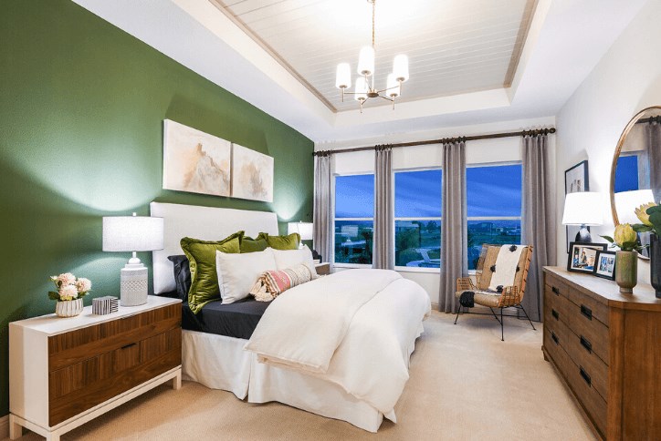
The Serefina by David Weekley Homes has a forest green accent wall that adds visual interest and an aesthetic link to the outdoors.
Soothing Pastels
Look for calming hues, such as pale pinks and blues, which add harmony to a space and help bring a sense of relaxation. These light colors can even be used as a neutral color in a more colorful palette.
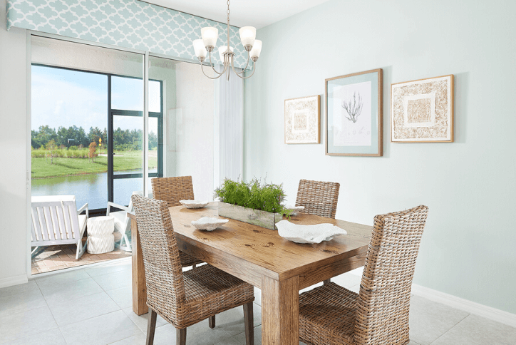
Soft pastels in the Washington townhome by Park Square Homes combine with a conservation view for a truly relaxing effect.
Muted Colors
This year’s color trends center around the idea that less is more. That’s why jewel tones are being swapped out for muted colors, such as blush pink and slate blue. Again, in a world full of overstimulation, muted colors add serenity to your space.
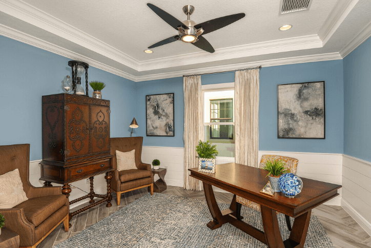
A home office is the perfect place to incorporate muted colors, like the slate blue walls in the Bayshore II by Homes by WestBay. This adds a sense of calm to your work-at-home days!
Moody Blues
Moody blues, such as the Pantone Color of the Year, Classic Blue, are reminiscent of the natural world, like a stormy sea or the midnight sky. Also trending, navy blue was named the world’s most relaxing color.
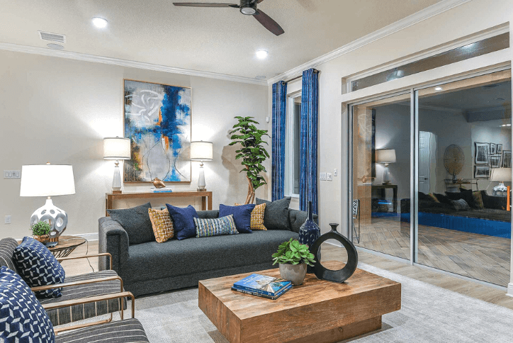
Don’t think you have to paint to incorporate our 2020 color trends! The Bayview by Beazer Homes incorporates moody blues in easy-to-change ways, like throw pillows, drapery, and artwork.
Warmed Up Neutrals
Consider adding neutral colors with red or orange undertones to them, instead of cool blue undertones. Think tans and beiges, especially in rooms with plenty of natural sunlight. Warm undertones will balance the cooling effect of natural daylight.
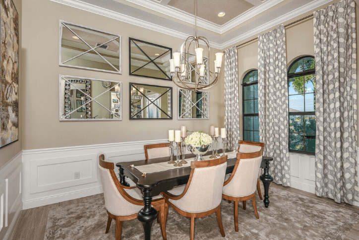
The warm beige walls and dining chairs balance the sunlight from two arched windows in this formal dining room, featured in the Key Largo II by Homes by WestBay.
Visit Waterset to see these model homes and more in person, or explore our Virtual Tours gallery from anywhere! Plus, keep an eye on our blog for more design trends as 2020 unfolds!

